Donation Pages: Why Nonprofits Need Them & How to Make Your Own
In this article
Isn’t it crazy to think that there are more than 1.5 million nonprofit organizations in the US alone? While it’s comforting to know that there are so many people working to raise money for good causes, it’s also overwhelming to try to stand out in such a saturated market as a nonprofit yourself.
One way to help? A solid and seamless donation page. With two-thirds of donors researching a nonprofit before giving, a key component is making the process of getting information and donating as easy as possible. Bottom line: your nonprofit should have a donation page and creating one is easier than you might think!
What is a Donation Page?
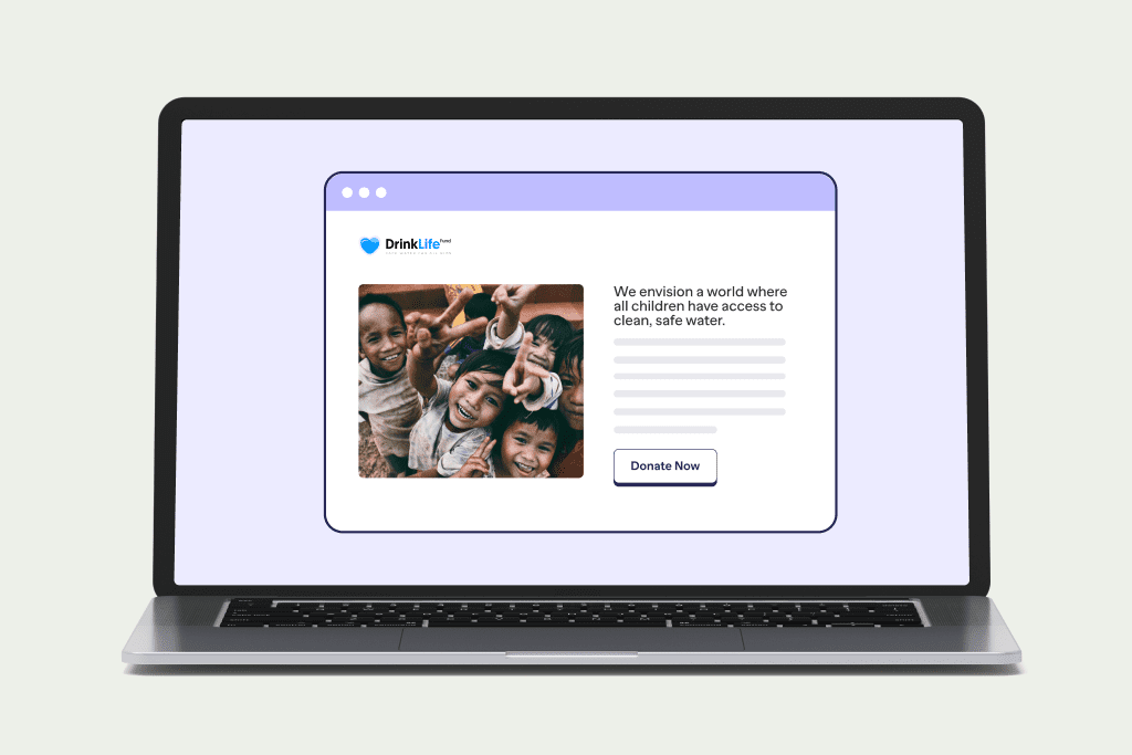
A donation page is a dedicated web page connected to your nonprofit organization that informs donors about your cause, your mission, and goals, and provides a place for people to donate digitally. They can be used as a stand-alone way for people to donate to your cause at any time or in conjunction with an active fundraiser!
What are the Benefits of a Donation Page?
Donation pages are honestly a necessity. Every nonprofit should have one because they come with a laundry list of benefits. If you’re thinking, do I really need a donation page? The answer is always yes. Here’s why:
They provide a simple place for online donations
Traditionally, donors usually give to their favorite causes when they’re at an event in person or they receive something in the mail and send a check in. These methods tend to be a bit restricting since you have to actually be putting on events or a donor has to physically mail their payment to you.
With a donation page, you open up the door for anyone anywhere to donate to your cause at any time. With the click of a button, they can easily give their donation — no envelopes or traveling needed.
It’s the one place to really put the ask out there
Your whole entire website is a place to educate people on your cause, show what you do to give back, and highlight some of the amazing things you’ve already done!
The goal isn’t necessarily to ask people for money as soon as they arrive on your homepage, but rather to show all the good you’re doing. The donation page is where you make the official ask!

Take StreetLightUSA for example. Their home page talks about their mission, their services, their vision, and how people can get involved. They have a simple “Donate Now” button on their homepage but aren’t blatantly asking for money.
When you navigate to their donation page, that’s where they have everything set up seamlessly for people to donate to their cause!
They pair well with your fundraisers
Donation pages are traditionally known to stand alone on a nonprofit’s website to simply collect donations for their overall cause. But, they also work wonders for any fundraisers you put on! Especially for tracking purposes.
Let’s say you’re putting on a 5K where people can donate via cash or check in person, but you want to provide a way for them to donate digitally as well. You can create a donation page just for that specific event. The same principle applies to virtually any fundraiser you put on!
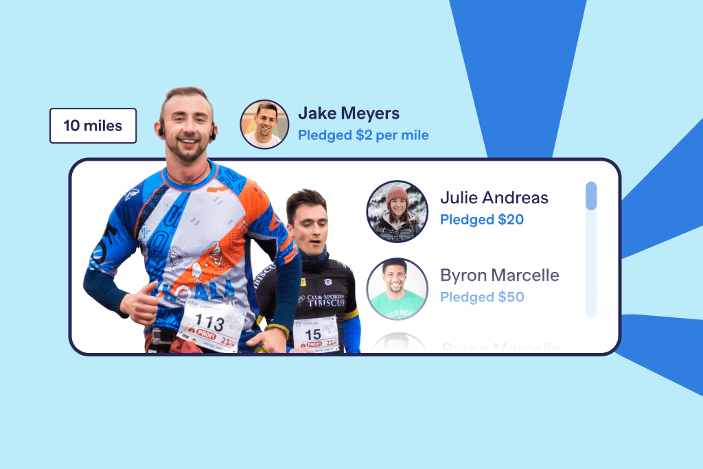
What’s really cool about RallyUp’s donation page functionality is that you can create as many pages as you want for free! And they can last for however long you want! But, the best part is that they’re actually free — we don’t charge a monthly subscription or a percentage of funds raised like some other platforms do.
They improve the donor’s experience
With donation pages, the goal is to make it so incredibly easy for the donor to do what you need them to do. Rather than being forced to go to your website and navigate through multiple pages, a donation page provides exactly what they need giving them little time to second guess donating. Having a “Donate Now” widget right on your homepage that leads to your donation page is always a good idea too!
They increase donations
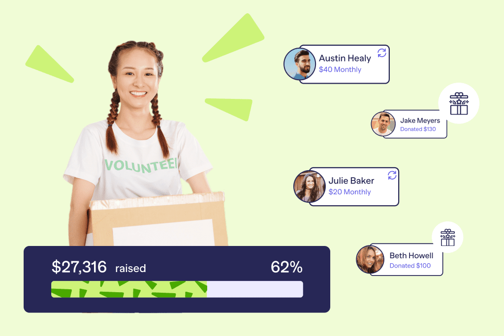
Easily, the most important benefit of a donation page is that it increases donations. If set up properly, research suggests you could have a staggering 25% conversion rate! It’s all about optimizing your page for the most potential. Fortunately, we’re about to tell you how.
Optimizing Your Donation Page
While every donation page can and should be unique, there are important best practices that can up your chances of bringing in more donations. Consider the following:
Emphasize your cause
A donation page is essentially a giant call-to-action (CTA) requesting people to donate. That’s why it’s important to reiterate your cause – what is the donation funding? Why is it important? Look at this as your last opportunity to convince them to donate.
Using StreetLightUSA as an example again, we love how they have a testimonial and a video on their donation page that supports their cause. It would be hard not to donate after watching that, right?
Have a killer hero image
8 out of 10 people will read your headline copy, but only 2 out of 10 read the rest. That’s a huge discrepancy. With that in mind, your hero image and copy on your donation page must be attention-grabbing and intriguing enough to either entice someone to give or continue to read.

Be mobile-friendly
More than half of internet users are on mobile devices. And research shows that 57% of them don’t trust or recommend sites that aren’t mobile-friendly. That’s why it’s crucial to ensure that your donation page can be easily accessible on anyone’s mobile device. Just think how much wider your reach will be!
Maintain your branding
When using a donation page in conjunction with your fundraising efforts, keep your branding in mind. Of course, it’s important to reflect the theme of your fundraiser on a designated landing page.
But remember, a donation page is an extension of your nonprofit – it’s just another vessel that can provide a place for people to easily donate. When donors access it they should still be able to recognize the nonprofit the fundraiser is supporting. So be sure to include the same logo, colors, messaging, etc.
Make the instructions simple
Too many hoops can easily turn someone away, especially if they are in a hurry. Once you have their attention on your donation page, make it easy for them by explaining exactly what you need, why you need it, and a quick way for them to donate to it. This can easily be conveyed through concise messaging that leads to a convincing CTA.

Make it easy to share the news
Did you know 92% of people trust suggestions from friends and family more than advertisements? Word of mouth marketing is crucial for your fundraiser. So make it easy for donors to share information.
Place buttons on your donation page that link all your information to different social platforms like Facebook, Twitter, and Instagram. This enables your donors to support your cause even more by sharing your donation page with others.
Offer different types of payments
Much like making an online purchase, your donation page should be just as easy. Consider accepting a variety of payment types like credit cards, checks, and even Apple Pay.
This will make it especially simple for someone to donate when they can’t easily access their credit card. RallyUp does a really good job at giving your donors different options to pay!
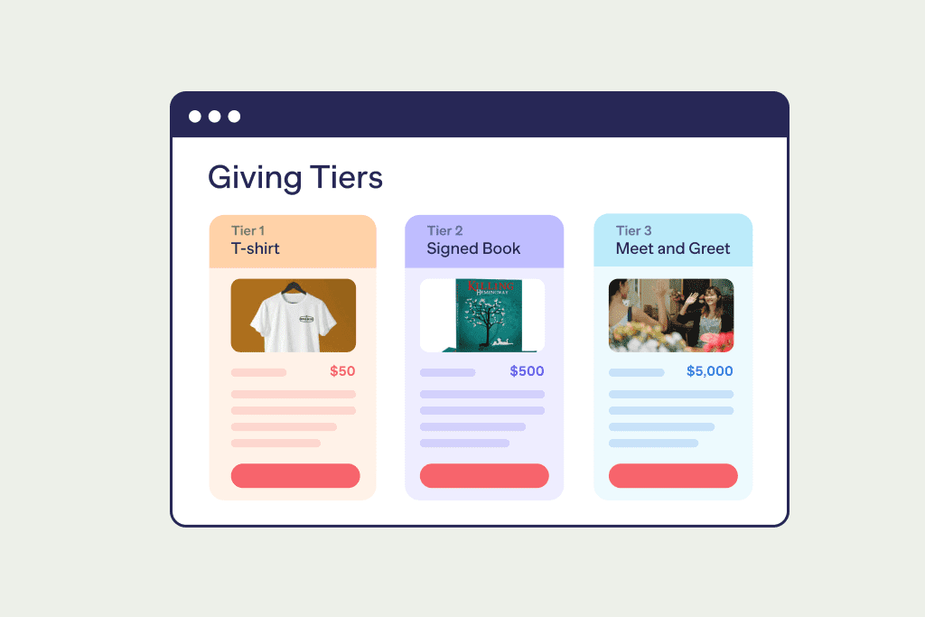
Provide different levels of giving
In traditional business, a tiered-pricing approach is where you appeal to more buyers (donors) by offering different levels of giving. This can be a great way to increase donations as behavioral research suggests that buyers (donors) often gravitate toward the middle option. For example, if you offer donations of $10, $15, and $20, most people will choose $15.
Customize your page
When potential donors navigate to your donation page, you want it to look attractive enough for them to stay there and donate! Make sure you customize it with some imagery, your color palette, and content that tugs on their heartstrings.
A Few Donation Page Examples to Inspire You
Not all donation pages are created equal. Some tick all the right boxes: they’re straightforward, streamlined, and on-brand.
Donation Page Example #1: Lucky Dog Animal Rescue
Lucky Dog Animal Rescue leads with cuteness: adorable puppies! The message is clear, and so is the call to action: donate. Simple and effective. It’s followed by info about the organization, but that’s just the fine print–if the user gets there, they’re probably already committed.
Donation Page Example #2: The Bowery Mission
The Bowery Mission has one of the most compelling donation page examples around. It pairs a topical event–in this case, Thanksgiving–with a powerful image. The donation options are front and center, whether for a monthly or one-time gift.
Donation Page Example #3: Education Africa
For an international organization like Education Africa, the donor’s location is important, so they lead with a list of countries to choose from. There’s also a helpful option to donate with a QR code. The page is super simple, but it gets the job done.
Donation Page Example #4: Hungry for Music
Hungry For Music leads with a massive declaration–Your Dollars Really Do Make a Difference– is an attention-grabber that makes donors feel valued. A really nice touch is showing exactly how each gift helps: $50 gets a child an acoustic guitar, while $1k delivers 20 instruments to an after-school program.
Donation Page Example #5: Oxfam
Oxfam keeps it minimalist and clean. A call to action followed by three emotionally-moving images serving as background for three ways to donate.
How To Create a Donation Page
Alright, so you’re convinced. You know you need a donation page, but where do you start? Is it expensive? How long will it take?
Introducing: RallyUp
RallyUp became a leading nonprofit fundraising platform by enabling users to create highly customizable, online fundraising experiences of all types – like raffles, a-thons, events, auctions, sales, sweepstakes, peer-to-peer, and even crowdfunding.
Not only that, but we have an amazingly seamless donation page that’s easy for anyone to use!
- The Pros? It’s completely free. When we say free, we mean free. We don’t charge a monthly subscription or a percentage of funds raised. Donors just have to pay the normal credit card fees like they would anywhere else.
Our pages are also customizable pages, super easy to use, they automatically send donations to your organization’s bank account, and come with an embeddable “give now” widget you can put on your website!
- The Cons? We honestly can’t think of any…
Here’s How It Works
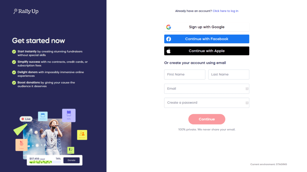
Step 1: Create Your Account
Whether you sign up using Facebook, Google, or email, RallyUp keeps it quick and simple. After entering your name and location, you’ll specify your organization type.
Step 2: Craft Your Campaign
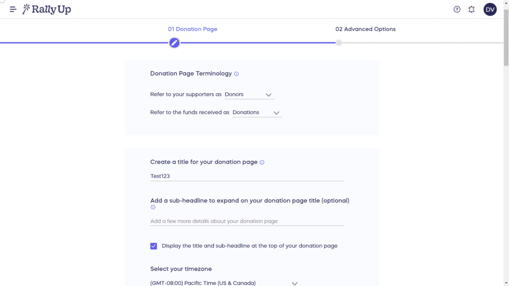
This is where it gets fun. Are you organizing a raffle or a sweepstakes? An auction or a sale? Do you want it live streamed? What about custom graphics? There are tons of great options to choose from as you enter all the deets on your campaign.
Step 3: Collect Your Funds
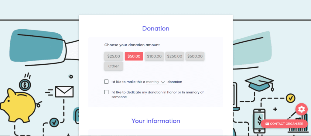
It’s time to choose how your organization will receive all that cash you raise! Whether you want a direct or managed account, RallyUp has partnered with Stripe to make sure your payments are secured and efficiently processed.
Leveraging the Best Donation Page
Donation pages are undeniably essential just in general and also for any of your fundraisers. They give a simple place for people to donate online, expand your reach, increase donations, and build awareness for your nonprofit.
To truly leverage these benefits, however, you need a simple setup process, low costs, flexible functionality, and some visual appeal! That leaves one platform left standing – Rally Up.
While you can run virtually any type of fundraiser online with the help of RallyUp’s innovative platform, you can also create an endless amount of seamless, customizable donations pages! All for the low cost of $0, literally. No monthly subscriptions and zero dollars being taken out of your funds raised.
And if you need help, our live support team is committed to your success. So, you’ll never be left in a bind.