Elevate Your Nonprofit Logo to Reflect Your Values
In this article
A successful nonprofit leader knows that recognizability is the key to building awareness and increasing revenue. But what does it mean to be recognizable? It means that people have heard of your organization, the community supports you, and there’s a general consensus that your nonprofit does good, important work that really matters.
For example, when you think of organizations like The Red Cross, Unicef, or the YMCA, you get an immediate sense of familiarity and respect. A big part of what makes those nonprofits so iconic is that, over the years, they have built up a trusted brand. And a major part of their brand is their logo: that little red cross, that familiar Y, and the perfectly-spaced blue letters of “Unicef” are unforgettable symbols that speak louder than words.
A well-designed nonprofit logo identifies your organization, communicates your mission, and sticks in the minds of your supporters. If it’s time to craft or update your nonprofit logo, we’re here to break down the different types of logos and share tips and inspiration to help you boost the visibility of your cause and raise more cash!
What is a Nonprofit Logo?
Let’s begin at the beginning: a logo is the visual representation of an organization’s brand. It brings together everything that your nonprofit stands for and values in one catchy, unique package. The best logos are memorable, recognizable, and are seamlessly aligned with your philanthropic work, so that your logo becomes synonymous with your brand identity.
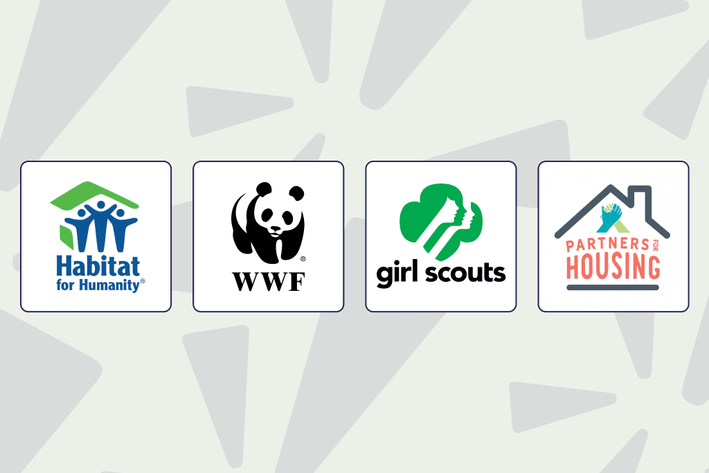
As we’ll soon see, logos can take on many forms, depending on the unique aims of your cause. Whichever type of logo you opt for, however, it’s critical that it reflects who you are as an organization.
Why is a Nonprofit Logo Important?
If you’re thinking that a logo may not be necessary for your nonprofit, consider this: a logo is the most recognizable brand identifier, and nearly half of consumers claim that an organization’s personality is effectively communicated by a logo. Including logos across all your channels—your site, social media accounts, and favorite fundraising platform—articulates who you are to your audience before they read a single word.
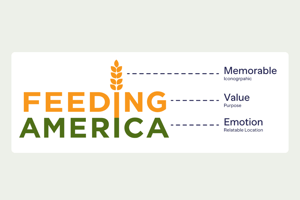
No matter how noble and important your cause is, if your nonprofit logo isn’t attracting attention and keeping it, you’ll miss out on supporters.
Here’s why a well-designed logo is a vital element of a nonprofit’s branding strategy:
- It reflects your values. The entire point of a logo is to communicate your nonprofit’s cause instantly and effectively. As soon as they begin scrolling through your donation pages or organization website, donors get what you stand for the moment they see your logo, even before they read the first sentence.
- It makes your supporters feel something. Brands articulate moods, and a relevant logo both kickstarts and maintains the process of building trust and rapport with your constituency, so they feel good about your organization.
- It makes you memorable. Unless you’re an internationally recognized and adored power brand (looking at you, Apple and Google) then you could probably use a little help standing out from the pack. A logo helps people remember and recognize your cause.
Nonprofit Logo Types: Which One Best Reflects Your Organization?
While there are lots of logo types to choose from, we tackle the most popular ones.
Monogram logos
Monograms are abbreviations of longer words or organization names. Some of the most familiar ones are PBS or NPR. Sometimes, a monogram logo can be super simple, like that famous Y that stands for YMCA.
Wordmark logos
Wordmarks have all the sleekness of monograms, but they’re actually full words, typically the name of the organization. A famous example is Google, of course, but the anti-poverty nonprofit One has also made use of the straightforward authority of the wordmark logo.
Symbol logos
When people think of logos, they usually think of symbols. Symbols are powerful because they’re recognizable without words. Goodwill Industries is an excellent example of a symbol that’s instantly associated with a noble cause, and that little smiling face reflects the organization’s mission because a sweet smile is what goodwill literally looks like!
An example from a lesser-known nonprofit is Medic, which delivers open-source software to health workers across the globe. Their symbol perfectly captures Medic’s mission: wings carrying a tiny cell phone. It’s simple, catchy, and reflects their brand identity.
Emblem logos
While emblem logos might seem a bit old fashioned, that’s actually part of their uniqueness! Now that the most popular brand aesthetic tends to lean toward clean and minimalist designs, your nonprofit can stand out by making use of some old school charm.
A great example of an emblem logo is the logo of the Everlasting Fruit Foundation, an organization that plants trees. The emblem is intricate and vintage-looking, but that detailed tree jives perfectly with the Foundation’s values and cause.
Mascot logos
Mascot logos aren’t as ubiquitous as symbols or monogram logos, but they can be just as effective. A prime example is the black and white panda mascot of the World Wildlife Fund. The moment you see that image, even without the accompanying WWF, it sends a strong message.
Obviously, the mascot you choose should be consistent with your mission. If you’re working in conservation, for instance, an animal mascot makes sense; if your organization is dedicated to education, maybe a stylized image of a teacher or child is a good idea.
A word of caution: if you decide that a mascot makes sense for your organization, it’s a good idea to take a cue from the WWF and include your company name alongside your chosen mascot. Why? If you rely exclusively on a mascot for your nonprofit logo but don’t have the massive recognizability of the WWF, you risk confusing your audience! After all, it takes time for audiences to link your mascot with your mission, so make it easy on them.
Mixed logos
Another creative route for your nonprofit logo to take includes mixing complementary monograms, wordmarks, and symbols! For example, the American Red Cross, Unicef, and Reach Out and Read all have straightforward and compelling symbols that communicate their mission, but they still help audiences out with their organization name.
7 Nonprofit Logo Tips
If you’re ready to update your brand logo or are creating your logo from ground zero, here are seven smart tips to keep your design journey on track.
- Make it simple. If you opt for a monogram or a wordmark, it should be super easy to spell and pronounce. Nobody has trouble pronouncing Google, for example!
- Make it fresh. This might sound obvious, but being boring and predictable rarely gets brands noticed. So get creative and come up with something that nobody else is doing.
- Make it catchy. If you make the most beautiful logo on the planet but nobody can remember it, you’re missing the point of nonprofit logos! While your logo should definitely be unique, it must be straightforward enough for audiences to remember it.
- Make colors and typography work for you. Unless tons of colors are your unique thing—like the PRIDE rainbow symbol, for instance—too many colors can overwhelm your logo. Same goes for typography: make your lettering consistent and well-spaced.
- Make it yours. As we’ve seen, the most effective nonprofit logos are deeply relevant to the organization. That means that your logo should be consistent with and reflective of your nonprofit mission.
- Make a slogan. While a logo can function very well on its own to build awareness for your nonprofit, a slogan kicks your brand up a notch. A slogan should be short, catchy, and consistent.
For instance, Nike’s slogan “Just Do It” has become synonymous with the company, so that even when you see the phrase even without that iconic swoosh, you still probably think of Nike! Take a less famous example: the NRDC (Natural Resources Defense Fund). Their logo has a polar bear and a monogram which reflect NRDC’s aims and values, but the organization also has a great slogan that they stick on all their communications: The Earth’s Best Defense. Catchy and to the point.
- Pick an understanding designer. While you can certainly make your own nonprofit logo, it can’t hurt to reach out to an expert! To select a designer that knows their stuff, request to see their portfolio and ask if they’ve worked with nonprofits before. While nonprofit experience isn’t an absolute must, it helps when your designer understands the unique needs of nonprofit organizations. After all, you’re aiming to do good in the world first and foremost, and your logo should reflect that!
Be Sure to Add Your Logo to Your Next Fundraising Ad!
Even with a creative nonprofit logo, marketing fundraising events is a full-time job! That’s why RallyUp makes promoting your next fundraiser as smooth as possible by helping you create easy-to-use donation pages, customizable crowdfunding campaigns, and fun live streaming options. Our tools are intuitive and absolutely FREE, so that your supporters can effortlessly contribute to your cause!