Nonprofit website design: 10 tips to make your site stand out!
In this article
Nonprofit leaders know that a website is an integral part of any successful philanthropic organization. The most effective sites increase education and awareness while also being the easiest way to create and maintain your nonprofit’s brand. Why? Because your audience takes your nonprofit website design very seriously. Most people will check out an organization’s online presence long before encountering it in person, and research shows that users form their opinion of your page within 50 milliseconds.
In other words, your nonprofit’s credibility and effectiveness is derived in great part from the quality of your website, which means that lightning-fast first impression had better be memorable! So, what should a nonprofit website include? In this article, we address nonprofit website design best practices so that your site stands out for all the right reasons.
1. Easy to navigate
Perhaps the most critical part of nonprofit website design is navigability, or how easy it is for your site visitors to browse your page and find what they’re looking for. If you’ve ever found yourself scrolling a site unable to figure out what the organization does or how to get to a different page, you already know how frustrating poor navigation can be. High-quality sites feature intuitive, seamless navigation and a well-balanced, harmonious hierarchy so that exploring them is both easy and fun.
2. Speedy
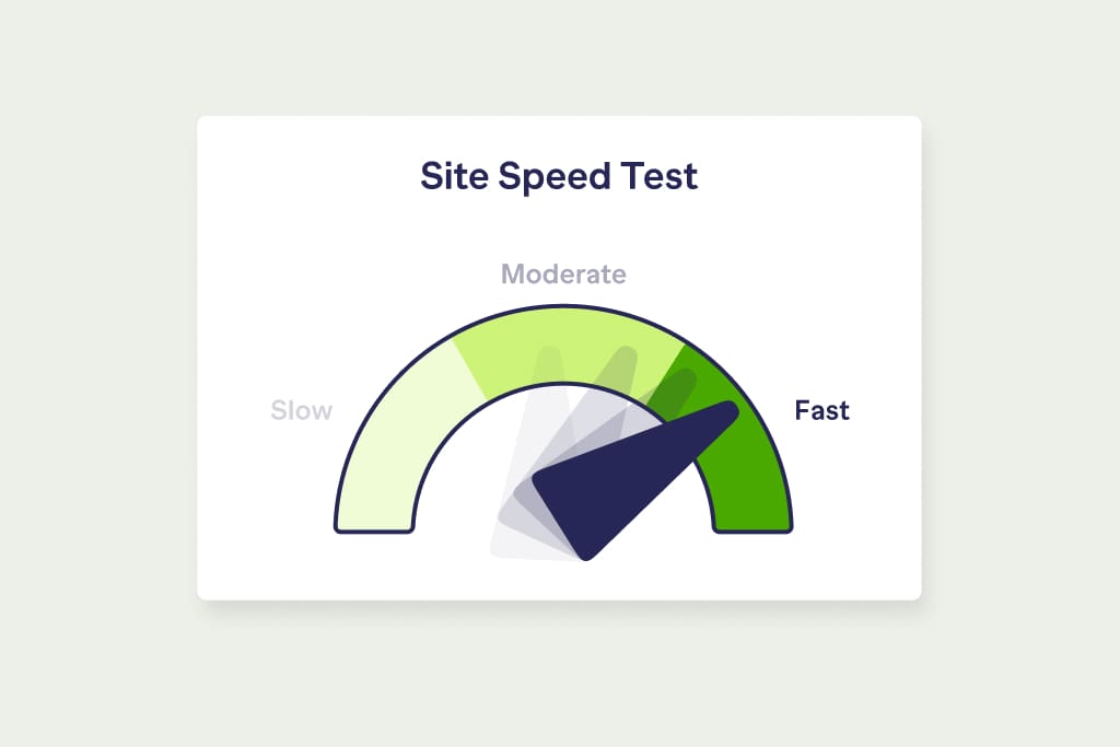
Most users have little patience for a website that takes a long time to load. In fact, studies show that if your website—or videos or any graphics on your page—take longer than 3 seconds to load, visitors will take off. This is especially true for younger audiences who have come to expect a swift and seamless digital experience.
The good news is that, if your nonprofit’s website is too slow, there are steps you can take to speed things up, like compressing graphics and removing any unnecessary data from image files, or optimizing and minimizing your website’s code, so that everything takes up less space.

3. Mobile friendly
Over the past few years, the use of hand-held devices has surged in popularity, especially among younger audiences. In fact, the majority of all website traffic across the globe comes not from desktop computers but from mobile devices, whether it’s a smartphone, tablet, e-reader, or even a smartwatch. In fact, Google looks for mobile friendliness when it recommends websites to users.
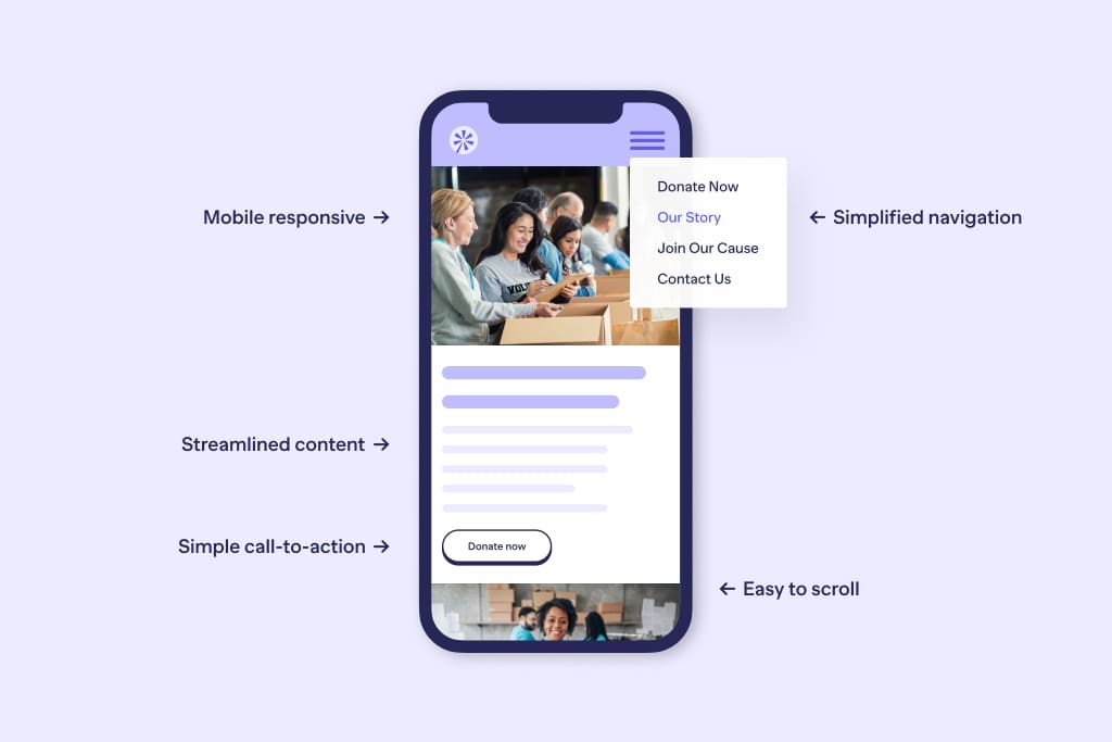
What this means for you: if your nonprofit website design is not mobile-friendly and responsive, then you’re missing out on a big chunk of your potential audience! Design that’s optimized for mobile includes the following features:
- Simplified navigation. A mobile version of a site will usually have fewer menu options or smaller images to make navigation easier on a small screen.
- Thumbs and eyes come first. When using a smartphone, most people rely only on their thumbs and eyes to navigate a website, and a mobile-friendly site is designed with that in mind.
- Streamlined content. On a hand-held screen, paragraphs upon paragraphs of text will be very frustrating to read. Mobile-friendly websites have straightforward, dynamic content that gets the point across quickly.
- Mobile responsiveness. A site that’s mobile responsive looks flawless on all devices, screen sizes, and browsers because it “responds” to whatever screen it’s displayed on. If you’ve ever seen images or text get cut off or look imbalanced on a small screen, you know exactly why mobile responsiveness is essential to an enjoyable user experience.

4. Clean aesthetic
A cluttered website looks dated, visually unappealing, and is confusing to navigate. Clutter comes in many forms. If images and text are crowded together or if there’s simply too much text, that’s an obvious example of clutter. However, a site can also appear cluttered if letters are spaced too closely together, negatively impacting readability. This means that the choice of typography and font play a major role in nonprofit website design. Similarly, too many items on the drop-down menu can look messy and unnecessarily complex.
Aim for a clean, minimalist aesthetic with plenty of negative space around images and videos. Not only is it simpler to navigate, but it also looks modern, showing the world that your nonprofit organization is no slouch when it comes to staying relevant and on-trend.
5. Consistent branding
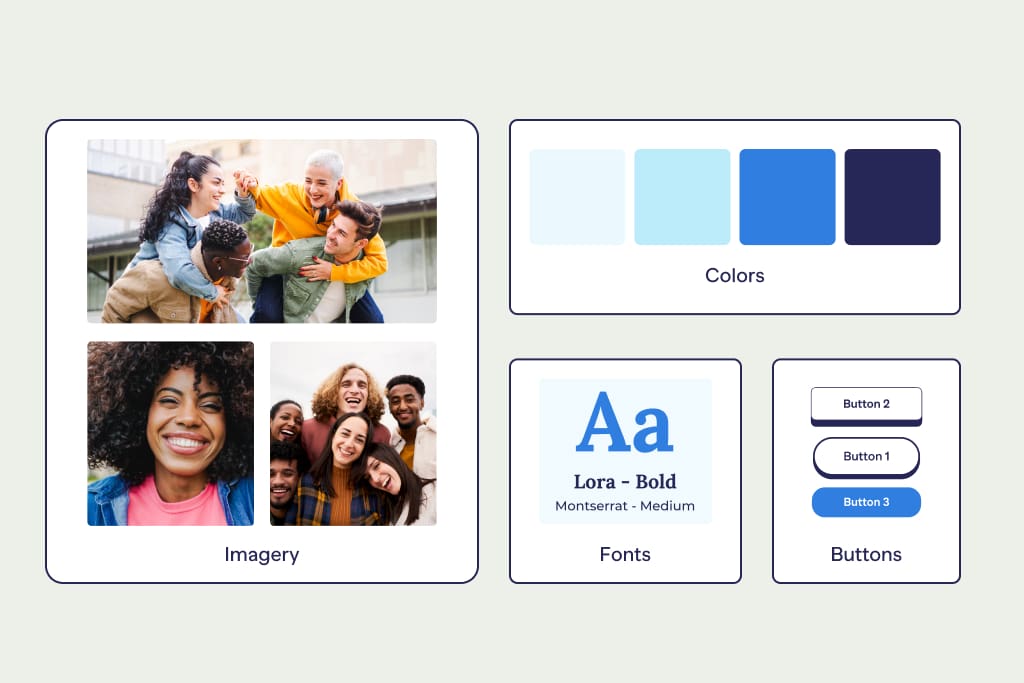
Every nonprofit has a unique story to tell and cause to champion, and this core narrative should be reflected in your brand identity. It’s not enough to simply state your mission on the About page and call it a day. A successful nonprofit website integrates its brand into every component of its website, from colors and fonts to images to tone. Even the shape of buttons and icons contribute to brand identity, sending a strong message to your audience about who you are and what you stand for.
For example, if your main landing page has light colors and the tone includes a touch of humor, keep up that cheery mood on your FAQ page and across all your donation pages, too. Maintaining brand consistency throughout your site facilitates recognizability and means that your visitors remain oriented toward your mission no matter what page they land on.

6. Reliable CMS
In a nutshell, a content management system (CMS) is software that allows you to create and manage fully functional websites even if you don’t know the first thing about writing website code. Most nonprofits and NGOs use WordPress as their CMS. WordPress is so popular thanks to its being fully customizable, free to use, and the fact that it makes it fairly easy to modify site content and design once it’s live.
Platforms like Wix, Squarespace, and Drupal are also common. They vary in price and features, with some offering templates specifically for nonprofits, donation integration, and contact forms for donors and volunteers.
7. Primary CTA
A clear and straightforward Call to Action (CTA) accomplishes several things. First, it helps articulate what your mission is. Second, it helps users figure out their next step. Finally, and most importantly, it prompts your audience to support your cause. While a nonprofit website might have multiple calls to action—i.e. Volunteer Today, Learn More, Sign Up Here, Donate Now—there is usually one that each organization prioritizes above the others.
For most philanthropic organizations, the primary CTA will be the Donate Now button. However, whatever you’re calling your audience to do when they’re on your site, make sure it’s bold, obvious, and easy to click on every single page. Don’t bury it at the bottom of a page or in the middle of a wall of text.
8. Relevant, compelling images
A website’s images can make or break user experience. Nowadays, nothing looks more dated than blurry images, stock photos, or cookie-cutter graphics. Here’s our advice to keep your site looking polished:
- All images, infographics, and videos should be crisp, fresh, and relevant to your organization.
- Be thoughtful when it comes to videos and animations since they can detract from user experience if they don’t load properly.
- You don’t need a lot of images for your site to be interesting. When it comes to creating a modern look and feel for a nonprofit website, less is more. One exceptional image that captures the essence of your philanthropic work is more powerful than a dozen less-relevant pictures.
- Nowadays, users love authenticity and relatability. It helps to build trust and rapport with your audience if you include a photo of your team, board of directors, volunteers, or donors.
9. Demonstrated impact
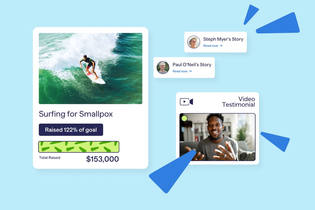
Donors are more likely to give to an organization that has a demonstrable and measurable impact on the world, so make sure that your website communicates the difference that your organization has made. There are many ways to show impact on your site, but the most effective will also be the most straightforward and easy to understand.
Use numbers
While it’s never a good idea to overwhelm users with a ton of technical data and jargon, one or two infographics can help your audience visualize the effects of your campaigns. Think clean, simple line graphs, check lists, or roadmaps that are easy to take in and understand in a single glance.
Share stories and testimonials
People trust people. If you have community members who are happy with the work you’re doing, share their stories! Whether you include brief narratives, 2-3 sentence testimonials, or photos of your volunteers doing their magic, the more personal, the better.
Include case studies
Create case studies of your achievements and post them on your site so that visitors can see for themselves exactly how you face challenges, overcome problems, and implement solutions.

10. Safety and security
If you’re collecting, transferring, or storing donor data on your site, like personal information, payment details, and other confidential intel, it’s critical to invest in website security. While professional maintenance is the most reliable solution, you can take steps to boost site security yourself:
- Use premium web hosting. While cheap hosting services can save cash, they often don’t offer automatic backups or round-the-clock customer service.
- Use strong passwords. Most security breaches result from weak passwords.
- Keep your site up to date and have it scanned regularly for malware.
- Take the time to create separate credentials for all your staff members.
The best nonprofit website examples to inspire you
To get a clear idea of effective design, we share a few examples of nonprofits that have built spot-on websites so you can get inspiration for your own site!
- Bill and Melinda Gates Foundation. The first thing you see when you open the Bill and Melinda Gates Foundation’s website is an uber-clean, white background, a single sentence describing what the foundation does, and a poignant, high-quality video. Notice that the video does all the talking. Even without scrolling further, the organization comes off as contemporary, compassionate, and authoritative—exactly what the founders were going for.
- WE Charity. This small Canadian nonprofit has only two menu options. Instead of an intro paragraph, the site leads with a single tagline superimposed over a collection of photographs that give the effect of a collage or a scrapbook. The message is personal and simple and the mood is light and upbeat. The key takeaway is that making a difference is doable, and they get it across!
- FHI360. This organization, based in China, is also using a white background for its horizontal menu. The immediate image you see looks like a volunteer or staff member smiling directly at the site visitor, which gives a welcoming sense of authenticity. The tagline consists of individual words separated by periods instead of a full sentence, making it both punchy and urgent.
From websites to fundraisers, your mission comes first
With an intuitive, quick, and secure nonprofit website that your supporters love to use, you can increase donations and showcase fundraising events. RallyUp is here to help your organization meet its funding goals with an online fundraising platform that lets you plan, promote, and host unforgettable fundraising experiences, like auctions, virtual 50/50 raffles, a-thons, and sales. Just like the best websites, our tools are intuitive, easy-to-use, and sure to delight your donors!